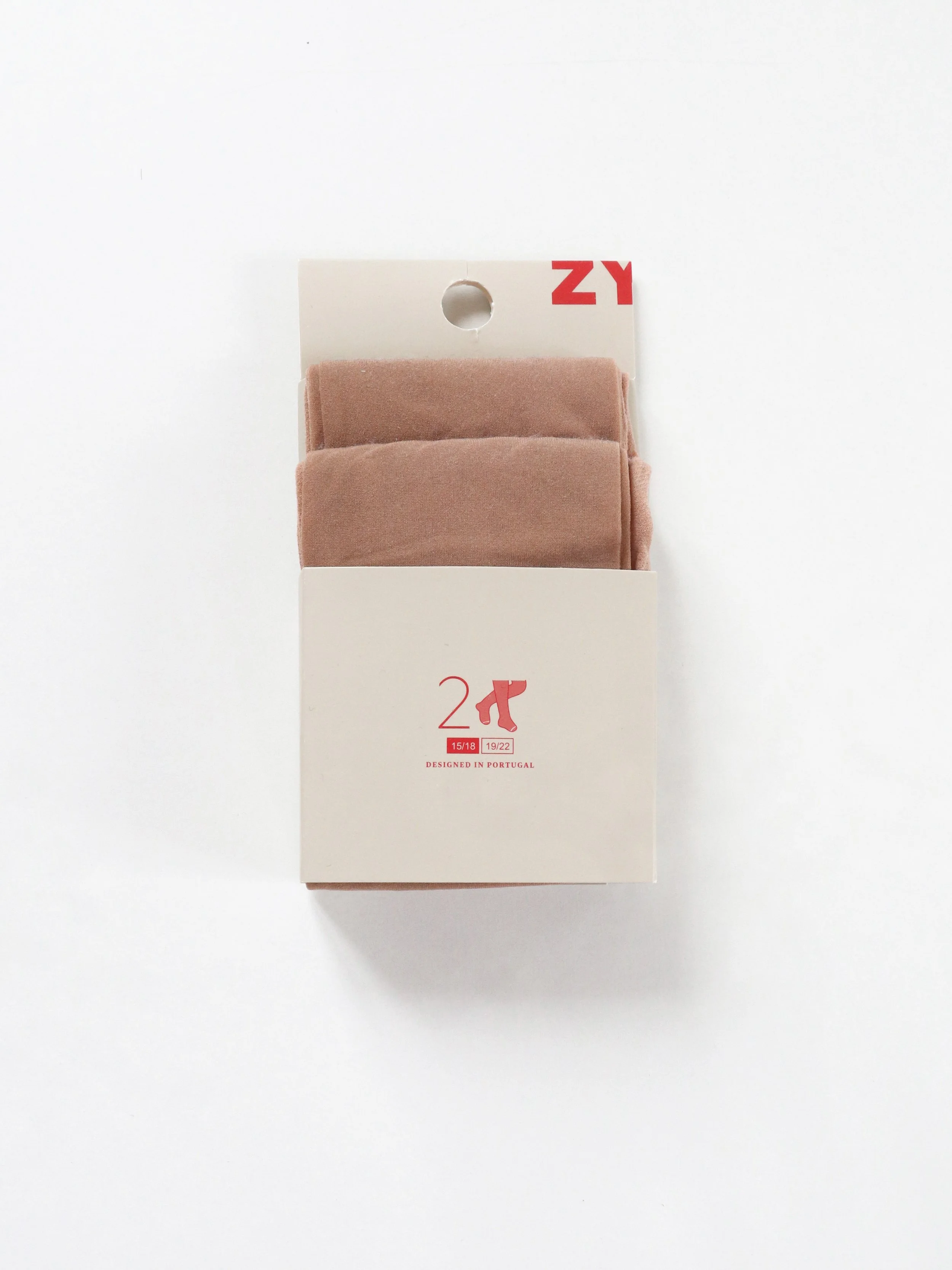
ZY | Packaging
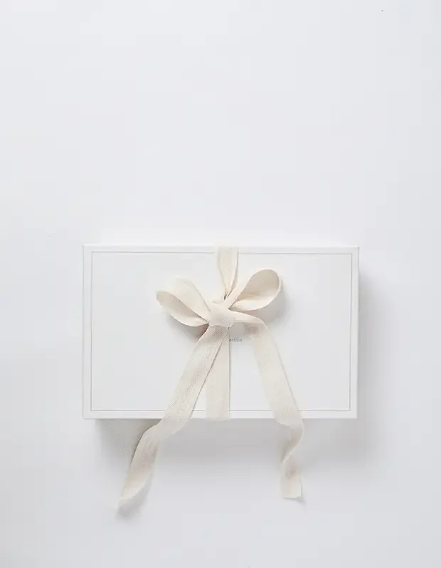
This project, developed at ZIPPY, (SONAE Group), was born from the need to rethink the brand’s packaging.
The existing design was visually overwhelming, with excessive text on the front that risked confusing customers rather than guiding them. Moreover, the overall look conveyed a low-cost, supermarket-style image that no longer aligned with the brand’s positioning. The challenge was to redesign the packaging to reflect ZIPPY’s evolution—creating a more refined, elegant, and premium aesthetic that resonates with the brand’s growth and ambition.

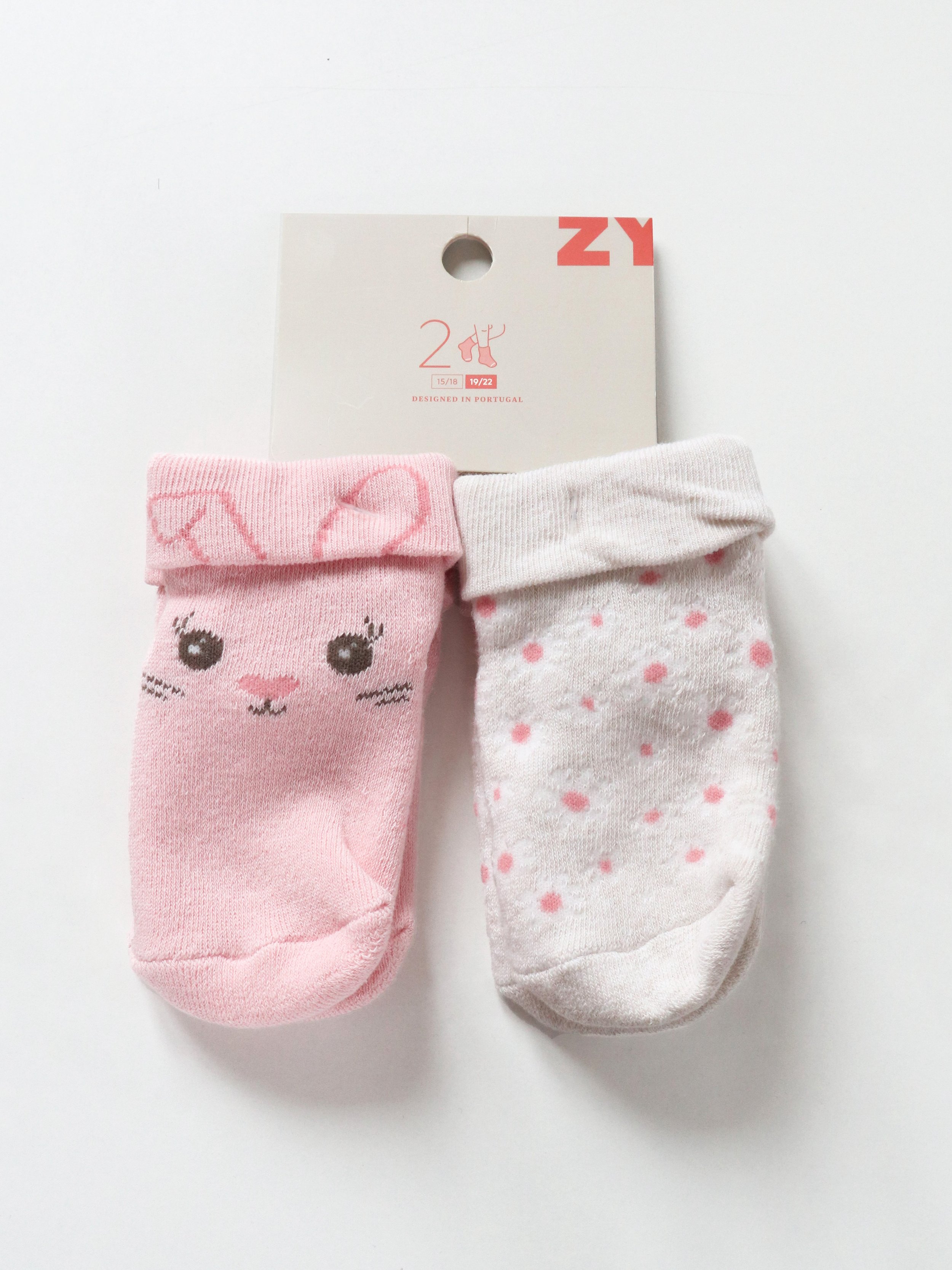
New Packaging
Faced with this need, and after several studies and tests, I arrived at the final design. By incorporating the brand’s existing icons—only adjusting the colors—and combining them with a beige background (also part of the brand’s palette), the packaging now conveys a calmer, more eco-friendly image.
This not only enhances the product’s appeal but also contributes to creating a more serene atmosphere within the store.
Here are the images of the new packaging:

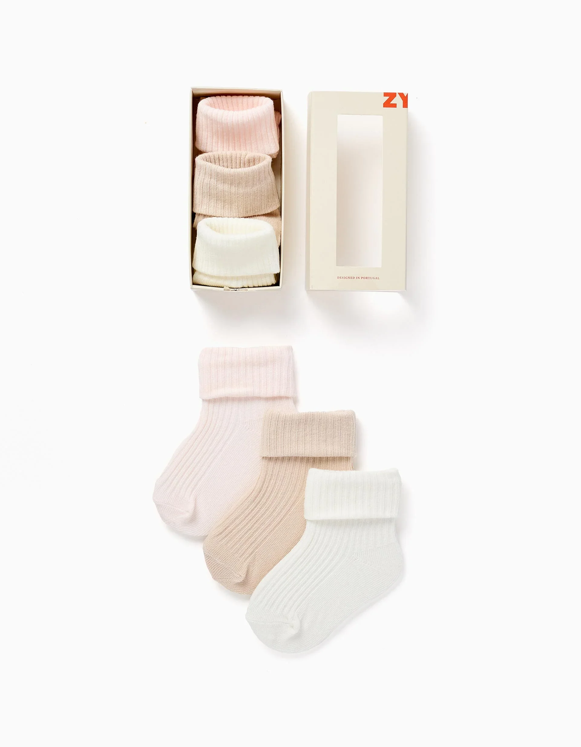
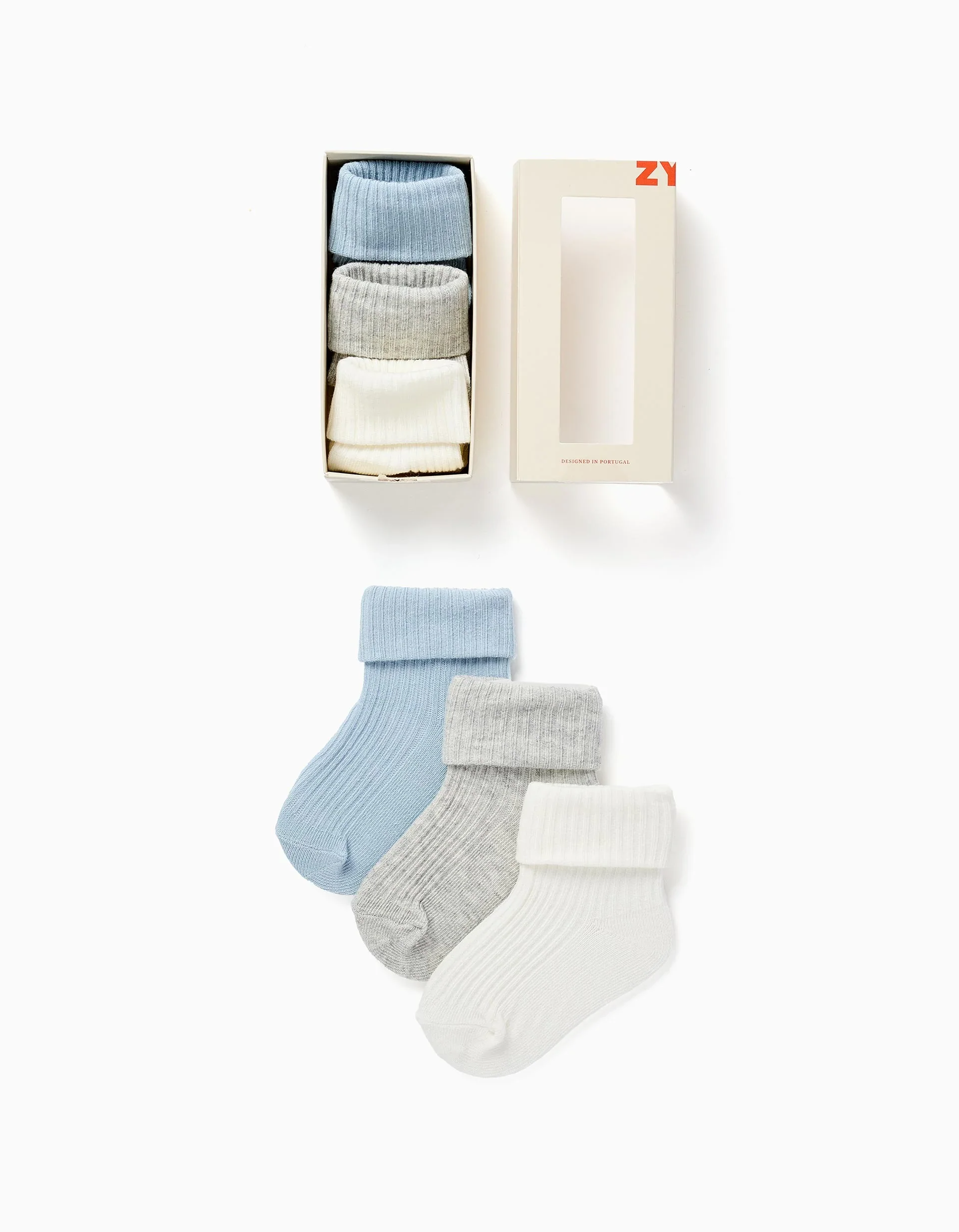
Newborn Socks Packaging
It was also necessary to design a dedicated box for the newborn socks, sold in packs of three, with colors coordinated according to the launched collection.
Here are the images of the new packaging:


Before & After: Packaging Redesign

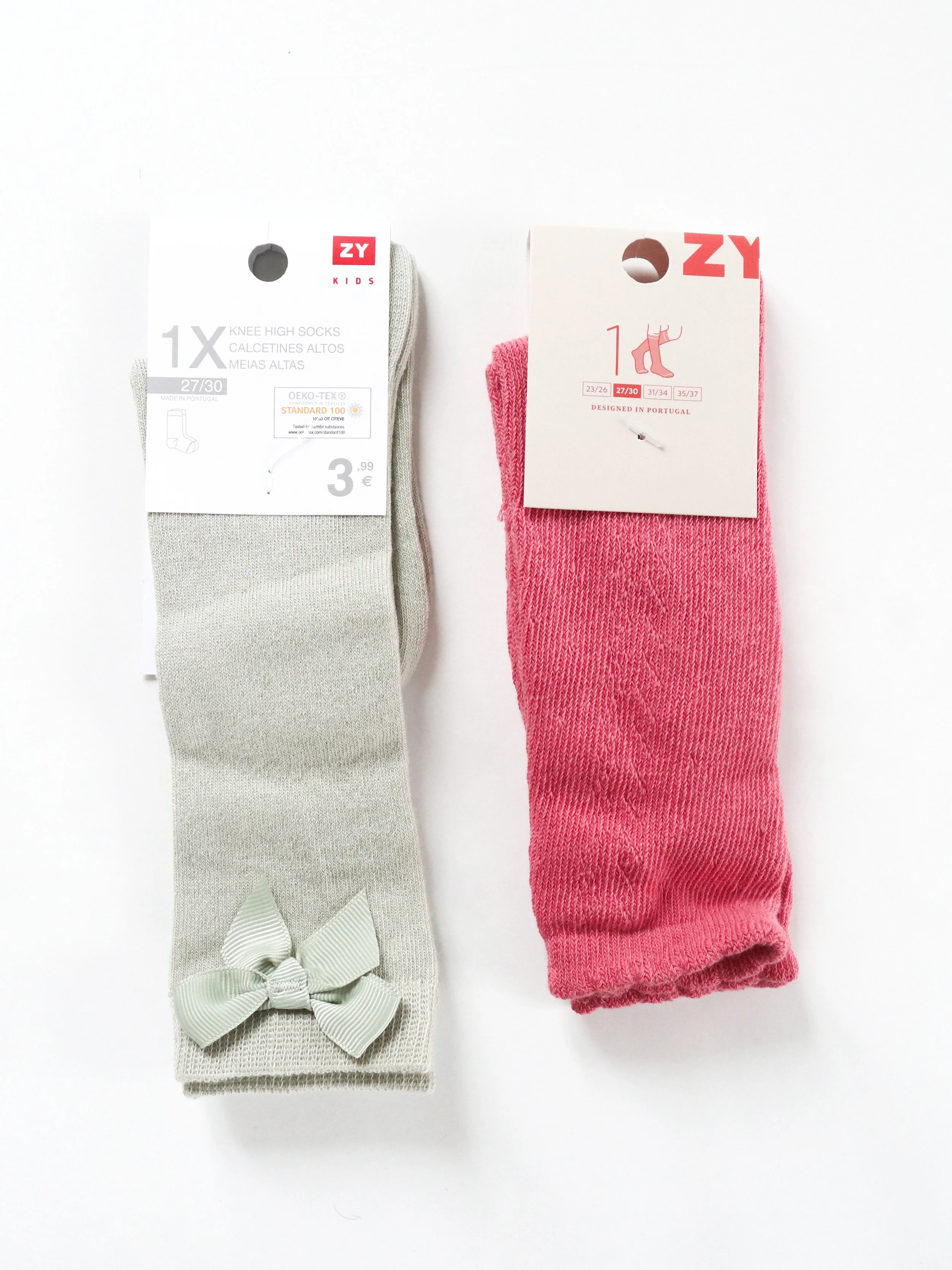
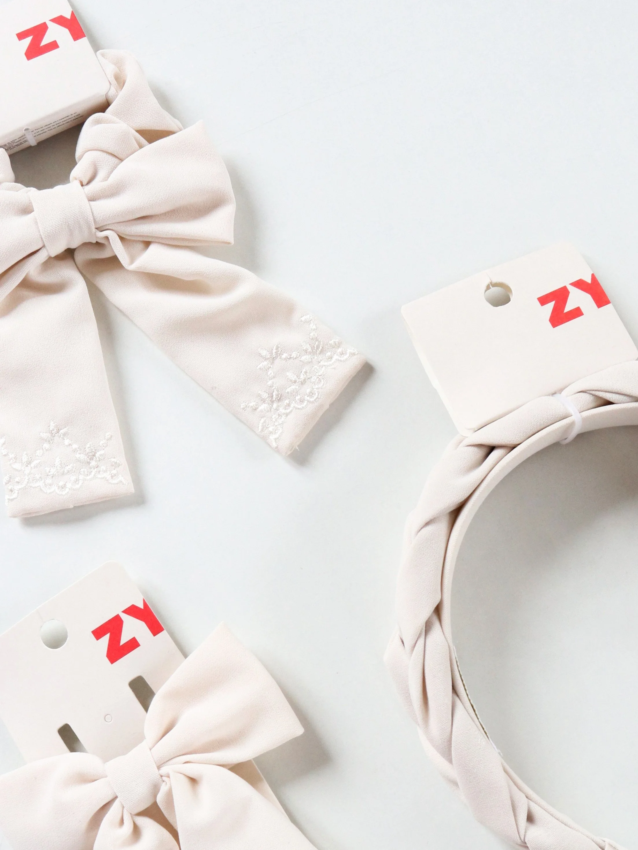
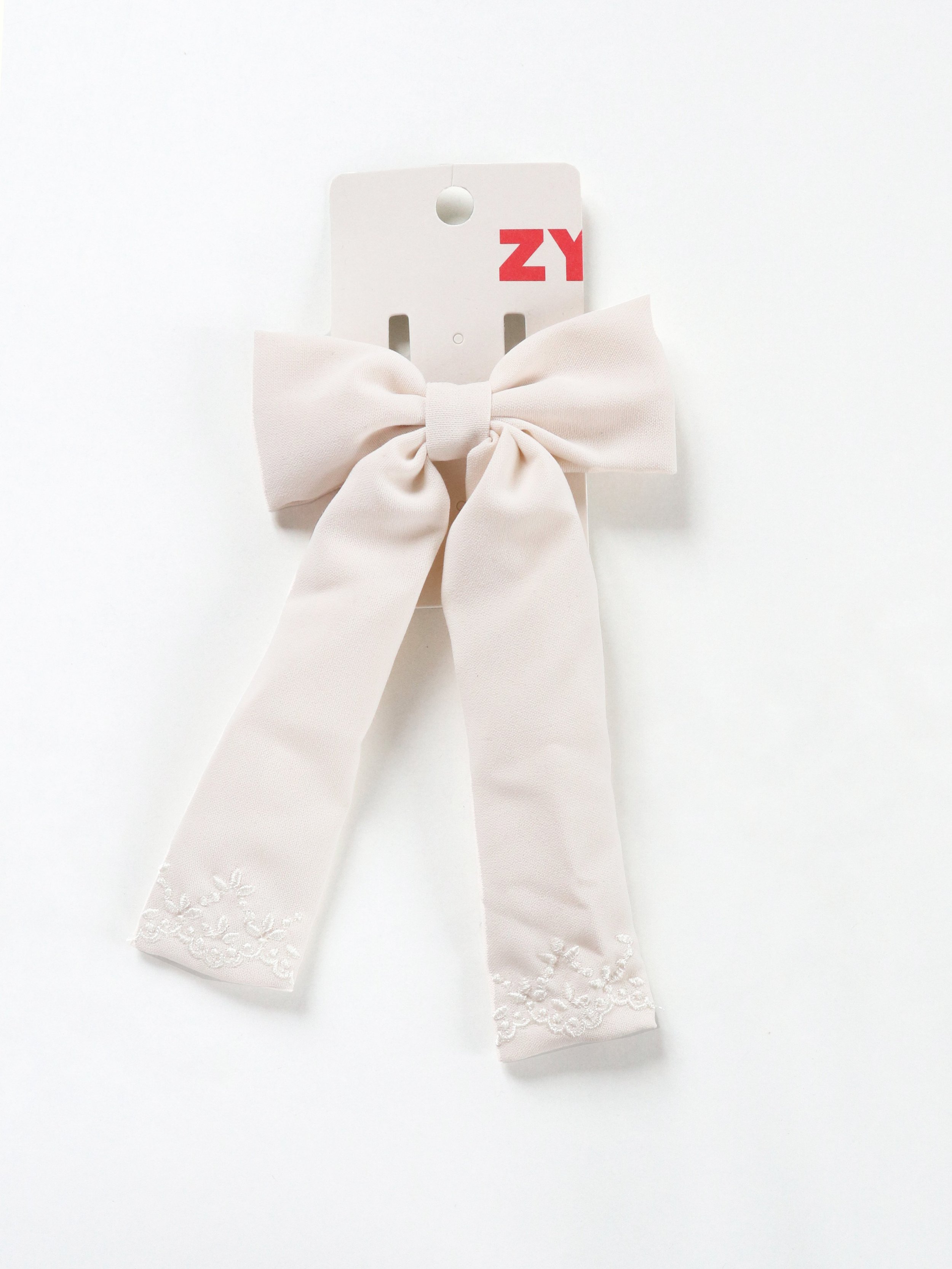
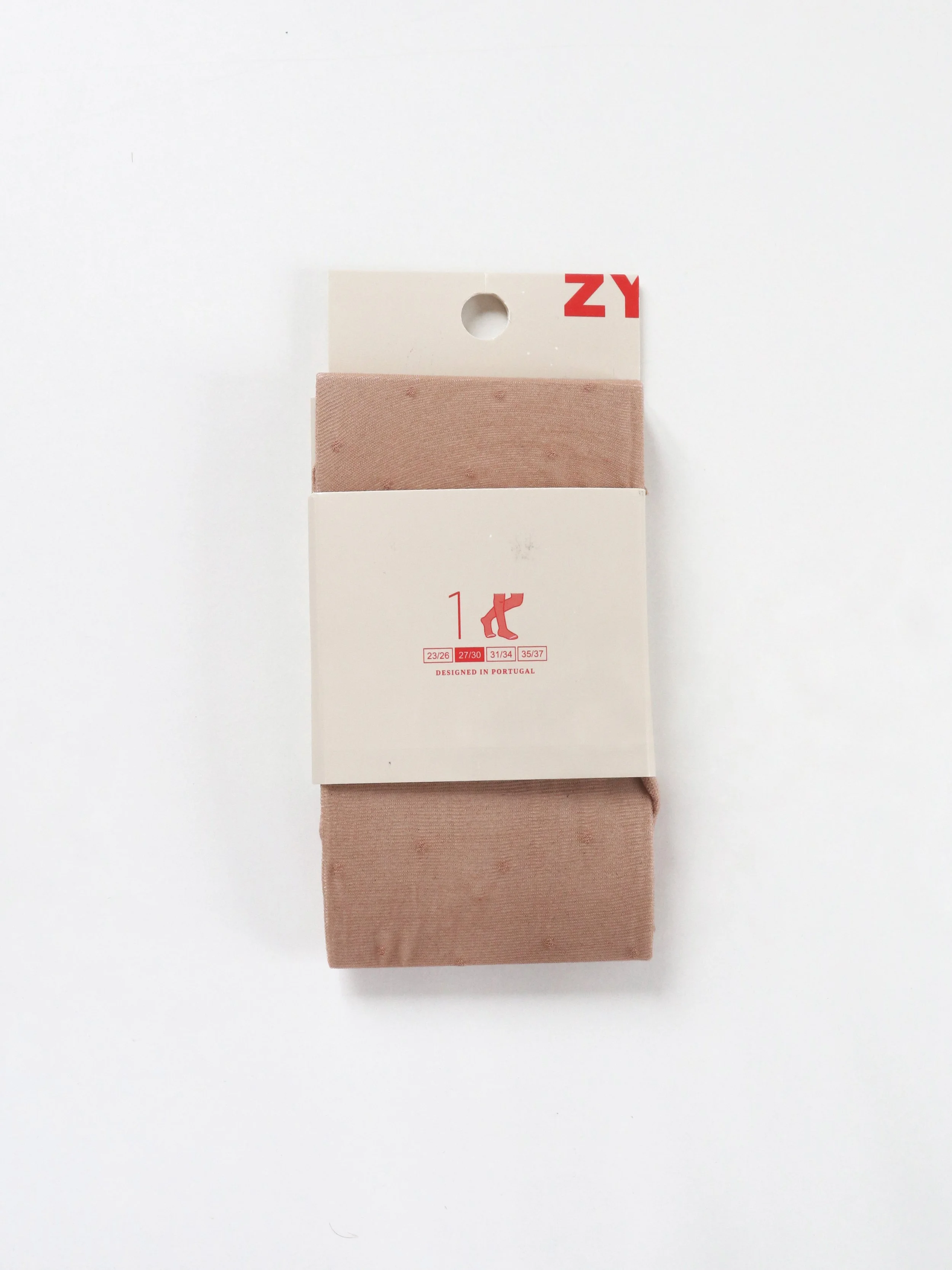
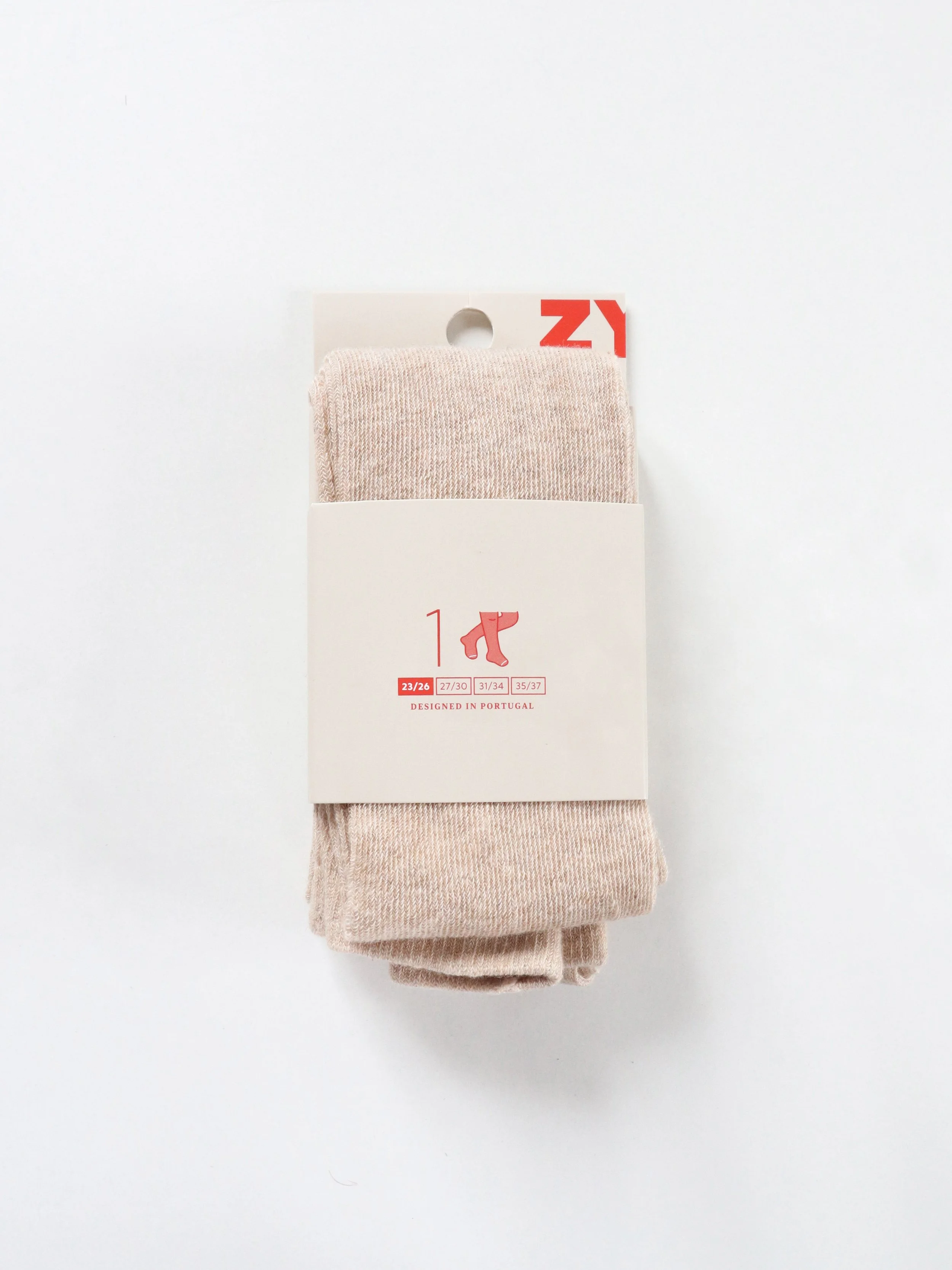
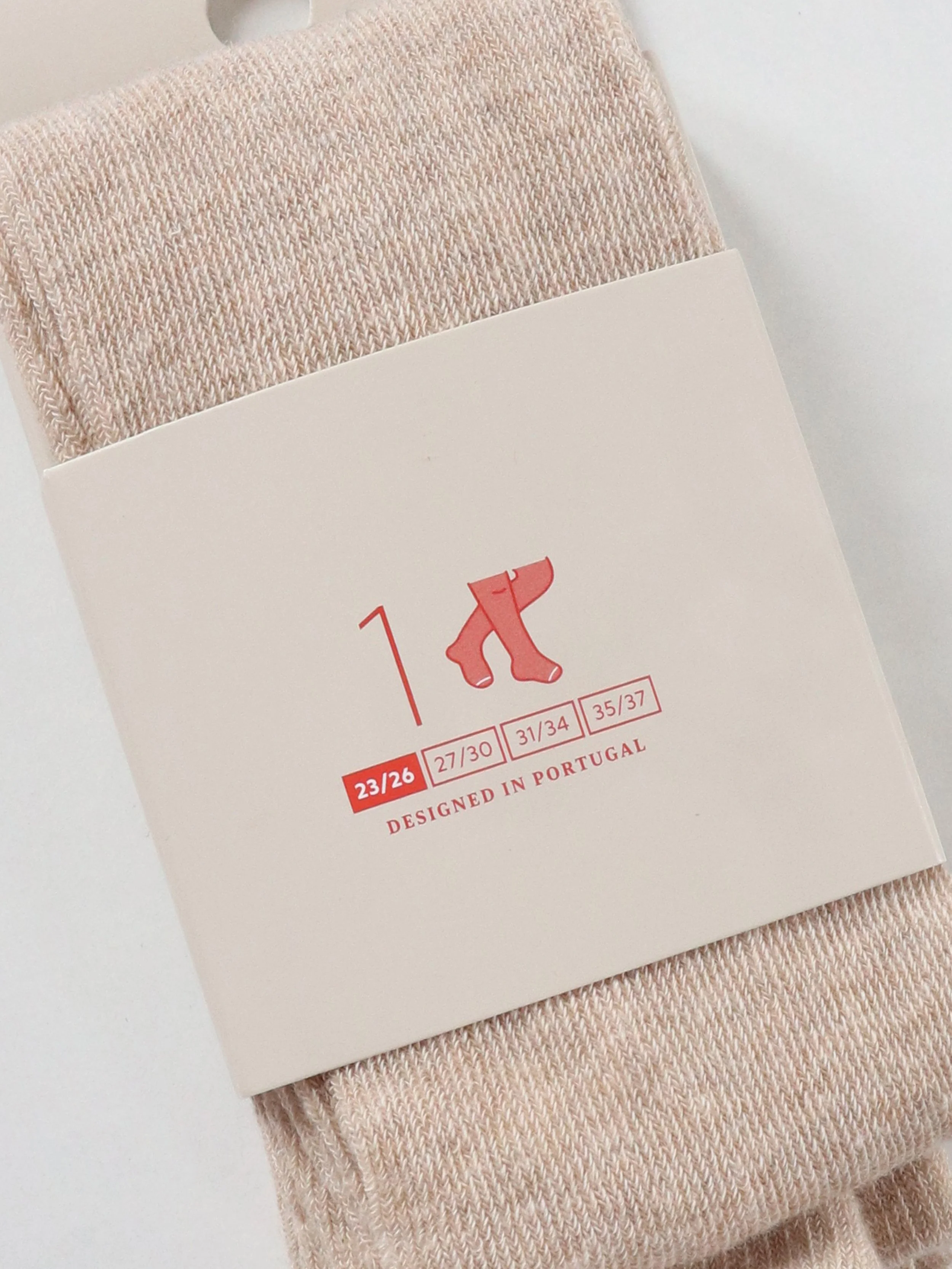
Accessories Packaging
The previous packaging of accessories was made of plastic. Caring about the earth, we’ve decided to transform the old packaging in papercards and adjust the design, to match the newly defined brand design.
Clean and without unnecessary information. The additional and legal information are on the back or inside the papercards.
Here are the images of the new packaging: